Case Study
Tenden
.
Project Overview
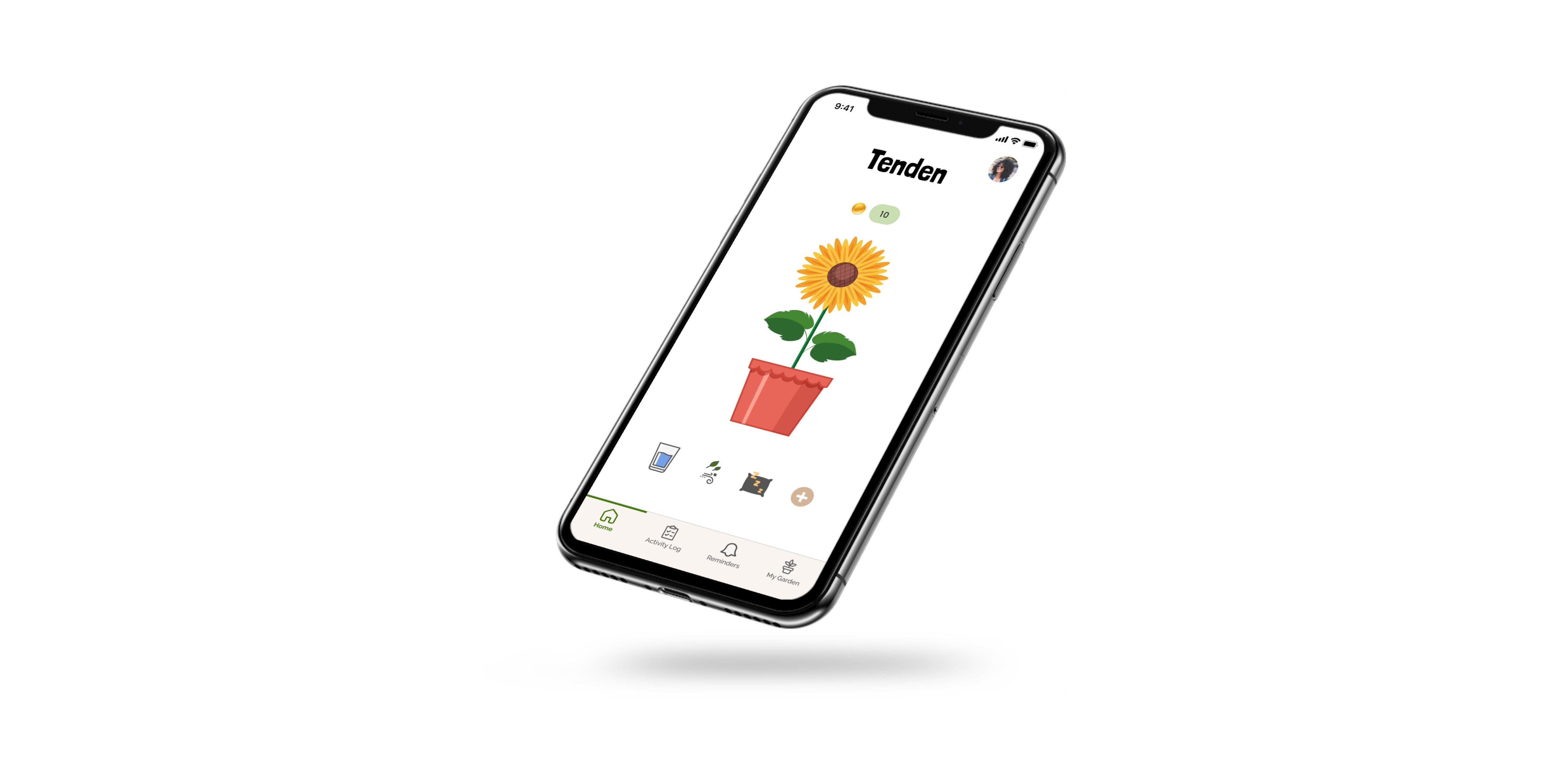
Tenden is a gamified self-care app that allows users to grow a virtual plant while simultaneously encouraging the user to prioritize the self-care habits of their choice. Every time a user logs a self-care action, they nourish their plant. The healthier you are, the healthier your plant becomes!
Tend your inner garden
Team
1 Product Designer
1 UX Researcher
1 Product Manager
1 Project Manager
Role
Product Designer
Duration
12 weeks
Design challenge for USC Iovine and Young's UX Design Class
Tools
Figma
Qualtrics
Adobe Photoshop
Adobe Illustrator
Miro
.
Problem
Humans are conditioned to automatically perform basic habits such as drinking water, sleeping, and breathing to survive. However, many people are not getting the adequate amount of these basic needs which is detrimental to their overall health. Our bodies can survive with the minimum amount of nourishment, but it will not allow us to fully thrive.
We take basic habits for granted
💭
How might we help people with busy, overwhelming, and stressful lives to remember to practice self-care in a fun and engaging way?
.
Solution
A visual representation of how habits affect your growth
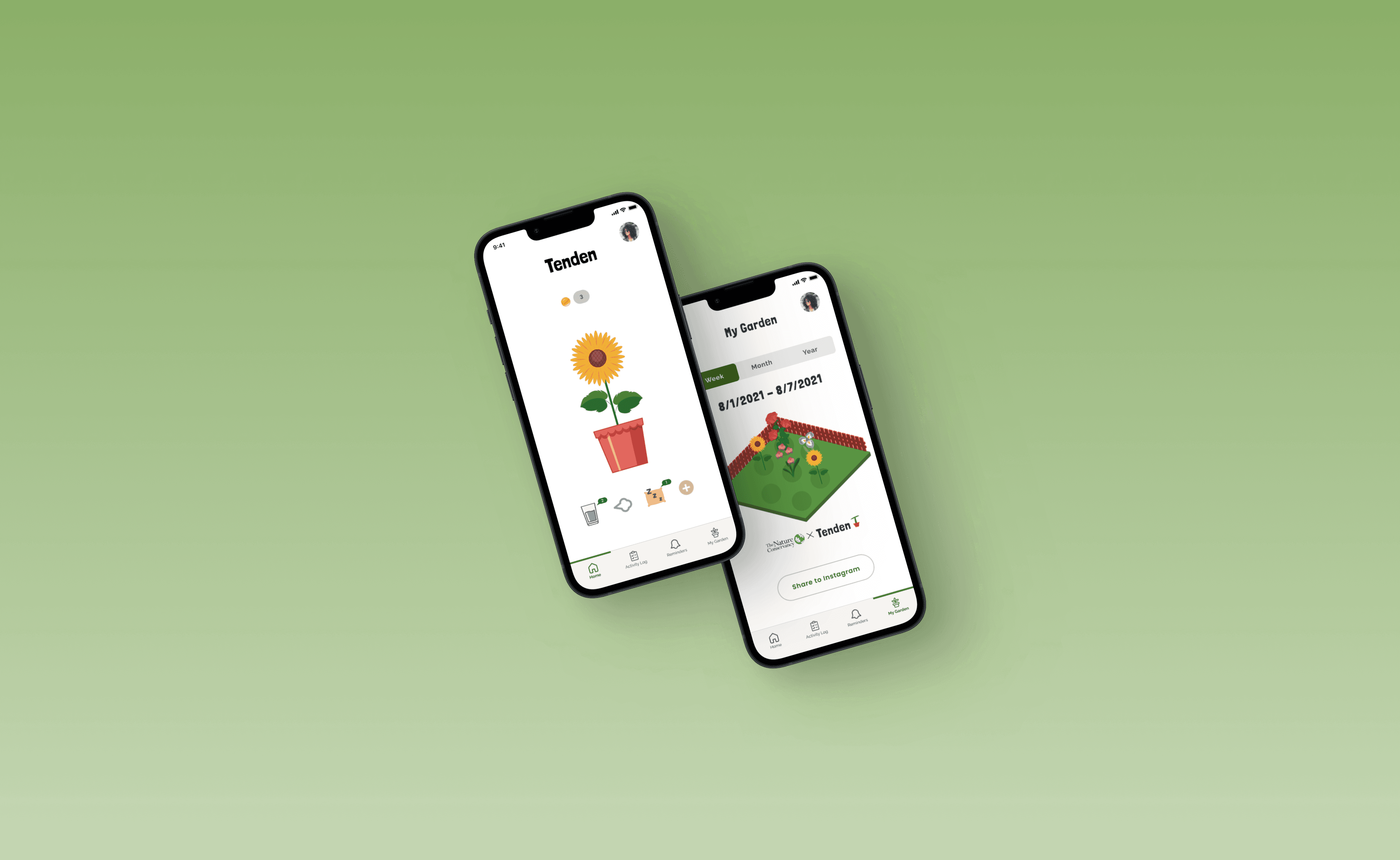
A gamified tracking app that motivates and reminds users to drink water, sleep, and take deep breaths every day. Inspired by the plant boom of the pandemic where an influx of people started growing plants as a hobby during quarantine, I decided to model the app as a virtual plant where you can visually see your progress as you practice these moments of self-care.
.
.
Market Research
Understanding the wellness space
Competitive Analysis
The segment of the market with digital fitness and well-being apps is projected to be worth $23 billion in 2023. This segment includes but is not limited to:
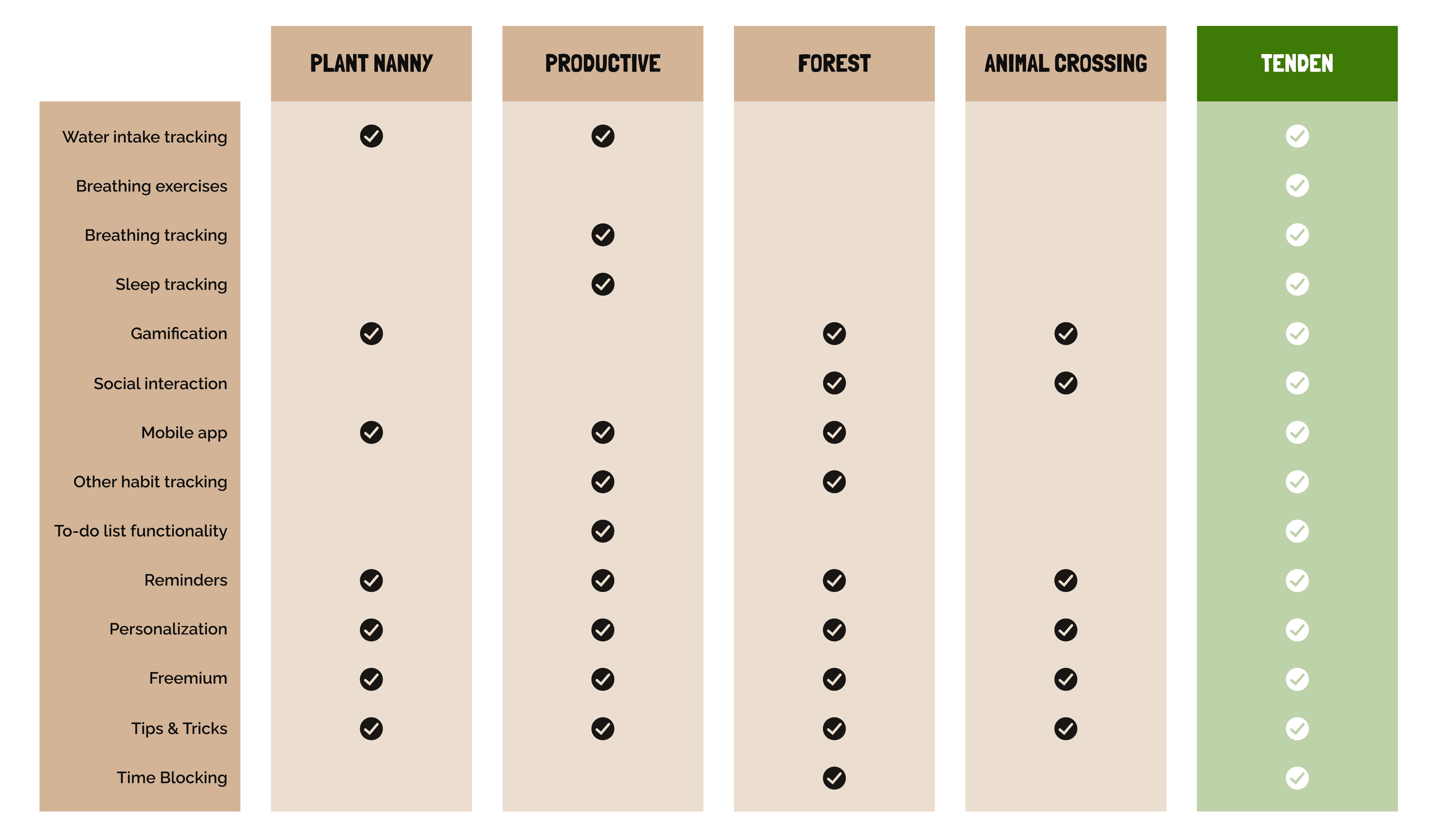
We conducted a competitive analysis on potential competitors in the market that provide incentives for users to take better care of themselves and/or have a social gaming aspect. Based on this analysis, as well as our research and objectives, we got a good idea of features to include (in green).

Fitness apps
💪🏽
🧠
🥑
Nutrition apps
Mental health apps
.
User Interviews
Apps with rewards or games are the ones I tend to check more often.

Minji Kim
Social Media Manager
Identifying pain points and desires
Interview Insights
I uncovered 3 prominent insights through these interviews:
I interviewed 6 different digital native participants between the ages of 25-45 to uncover unmet needs, desires, and frustrations. To help guide my interviews, I identified a few overarching goals for my interviews:
🌱
🌱
🌱
🌱
Their health and wellness routines and goals
What they use to track their progress
What motivates them to be consistent
Pain points of maintaining a consistent routine
Tracking things feels like a chore sometimes.

Danielle Jean
Student
I feel like constantly checking your weight or how many times you eat can be really toxic and lead to unhealthy habits.

Hanni Lopez
Dancer
Users find metrics overwhelming and sometimes toxic when it comes to self care
2.
Users are more likely to consistently use apps with games or social aspect
3.
Lack of gratification leads users to become unmotivated
1.
.
Ideation
How might we help people take care of themselves the way we take care of plants?
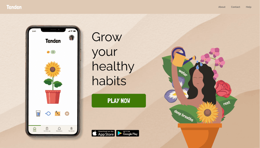
This idea was inspired by the pandemic when people started buying houseplants and gardening as a quarantine hobby. Plants and humans share basic needs, so growing plants visually shows the benefits of daily habits like drinking water, rest, and deep breaths, which can improve health if done intentionally over time.
.
Personas
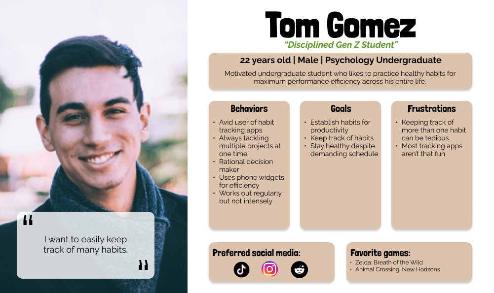
Targeting health conscious and casual mobile gamers
From our interviews, I concluded that our target users should be health conscious Millenials and GenZ, ages 20 - 40, particularly those who are active on social media and participated in the gardening trend during the pandemic.
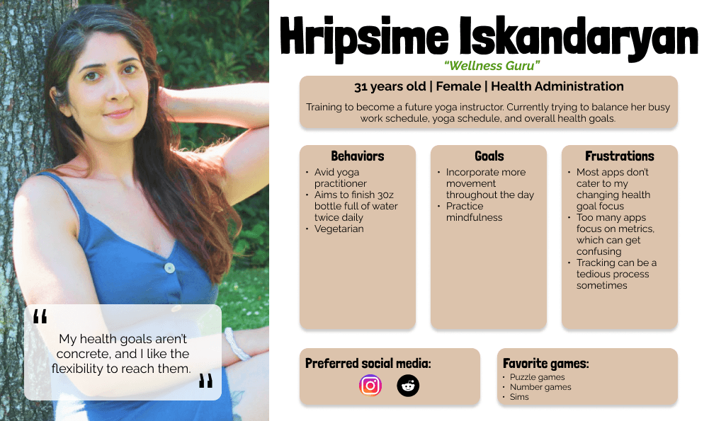
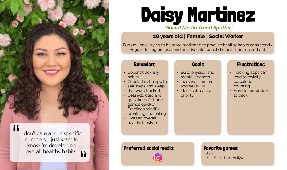
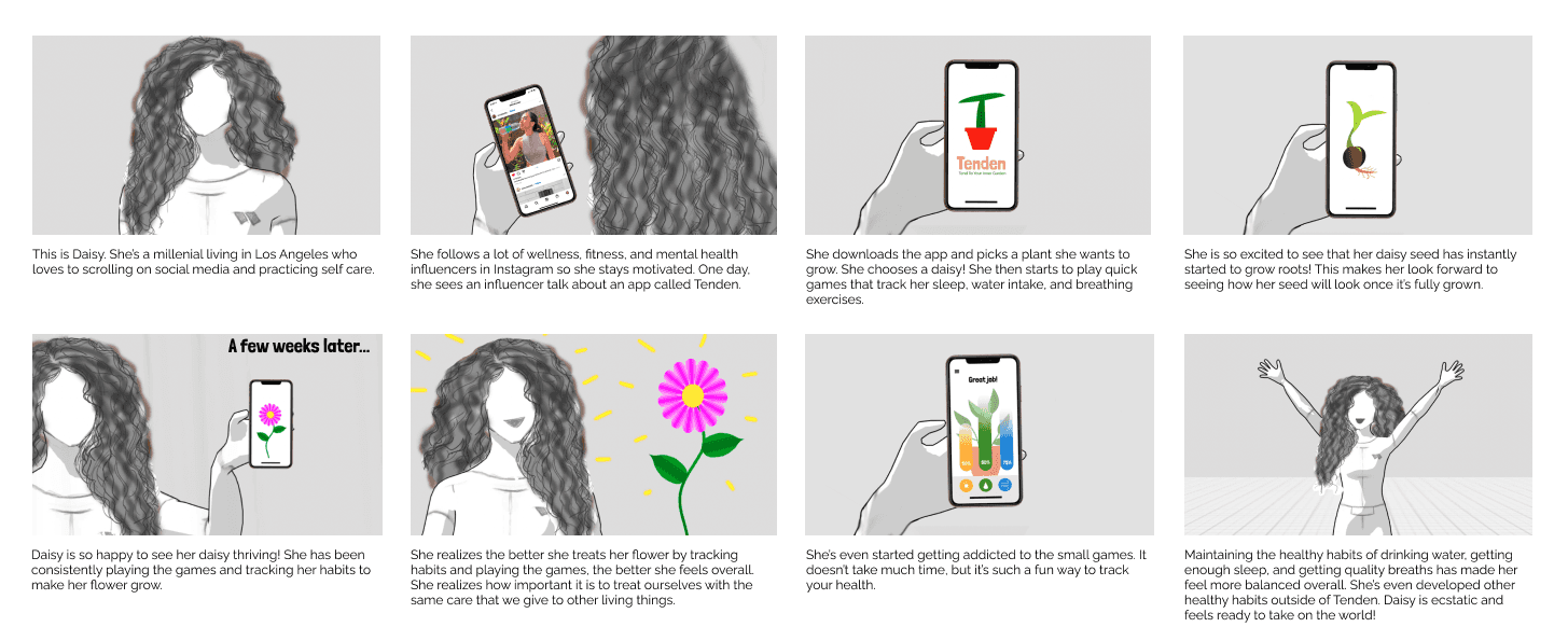
Creating a storyboard for Daisy's user story helped me understand her entry point and potential roadblocks she might encounter along the way. It also helped me visually predict her journey through the app.
.
Wireframes
Exploring onboarding and game functionalities
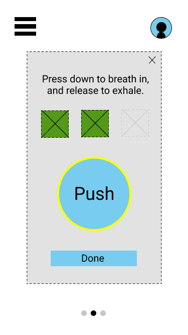
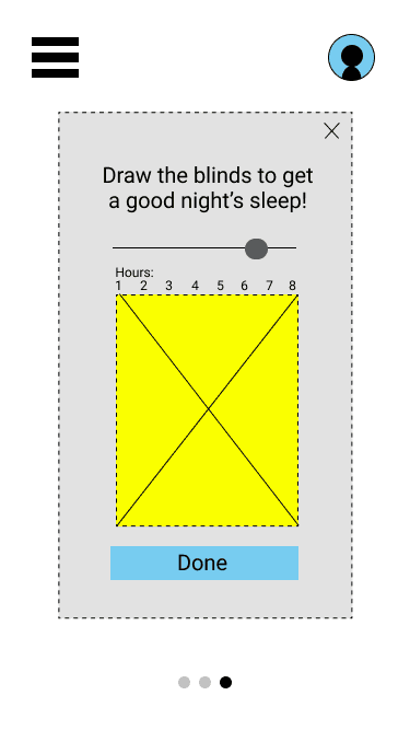
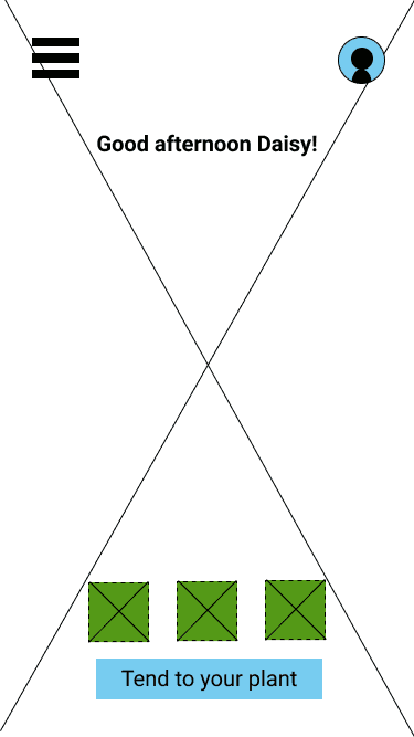
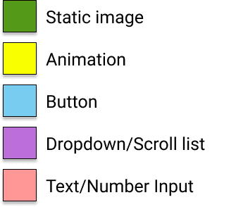
I created wireframes showing the user story and flow for onboarding, habit tracking, and navigating the social aspect. Because there were so many moving parts, I decided to color code and provide a legend for the wireframe so it was extremely clear for users navigating the flow.
Onboarding flow that sets up experience based on users's unique parameters
First iteration of game functionality to log habits
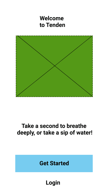
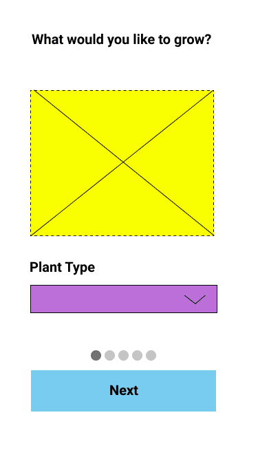
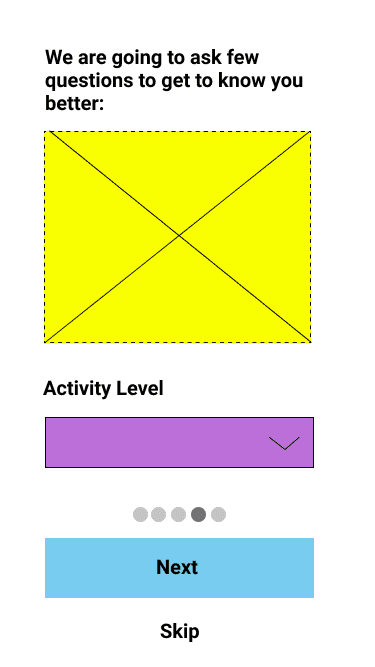
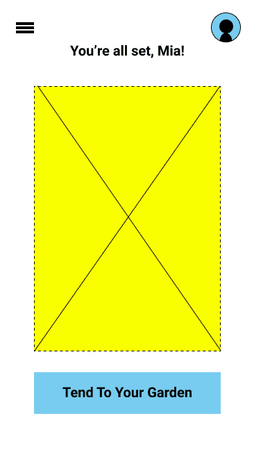
Changes based on selection from drop down menu
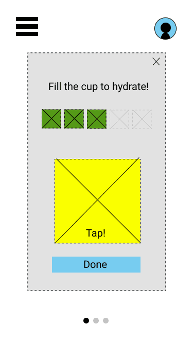
As they fill each cup, icon will show up to indicated how many they have filled
Button will expand when pressed, slowly contract when released
Number of breaths indicated by icons
Progress on each habit
1.
2.
Image of seed of chosen plant here
Blinds will close with swipe. Users stop at hour they desire.
.
Preliminary Testing
Validating my user flow assumptions
To test my assumptions that a gamified habit-tracking app would be the best solution tracking the three fundamental habits of water tracking, hours of sleep, and number of deep breaths taken, we conducted a Qualtrics survey of over 60 people.
We tested a low-fidelity protoype, specifically focusing on the 2 user stories I created above to determine if users understood the intended use of the app.
In the survey we asked questions such as:
What do you think Tenden does?
🌱
Would Tenden motivate you to track your habits like a game?
🌱
.
Challenges Identified
Testing revealed confusion for many users
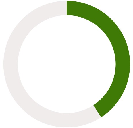
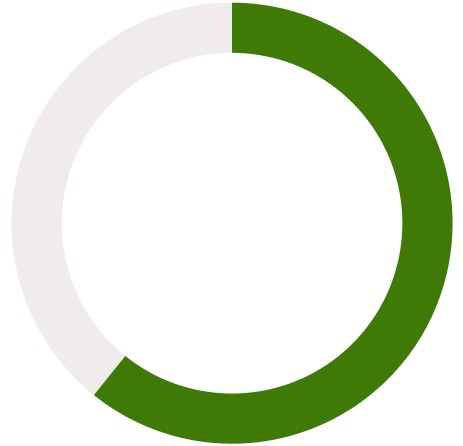
The feedback revealed that users were very confused about the purpose of the app, confusing it as an app to take care of plants. Those that knew exactly what the intended use was would have preferred to add habits that align with their own personal health goals.
40%
"Is this app for plants?"
60%
"Can I add my own habits?"
.
Letting Go
Coming to terms with user testing results
I was really passionate about promoting those 3 key habits, but it tested really poorly with users. I had to let go of that idea and rework our features to reflect the needs and desires of our users. We listened to our users and decided to focus on customizable habits and make the gamification aspect as simple as possible. As a compromise, we start the app off with those 3 habits, but users can change them any time. We also clarified our messaging to ensure that users knew the intended use of the app - this isn't for plants, it's for humans!
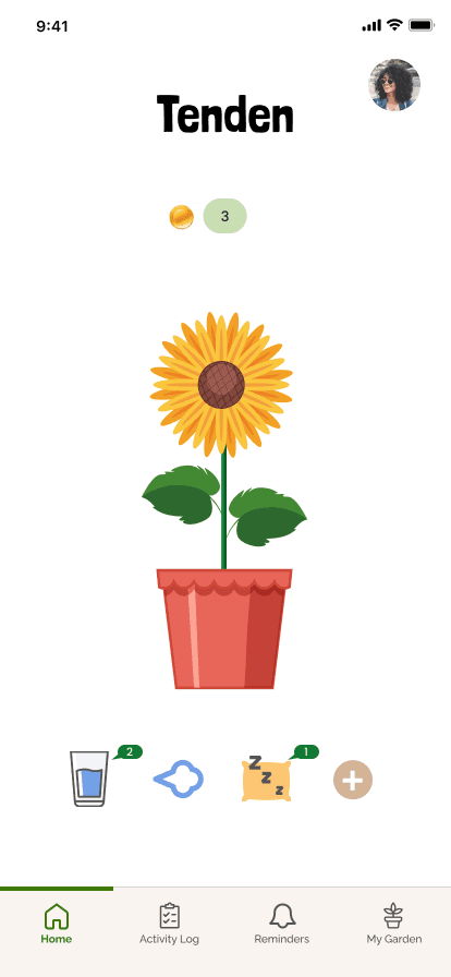
Starting with the 3 fundamental habits, but user can add, edit, or delete
.
Information Architecture
Building the inner framework of the app
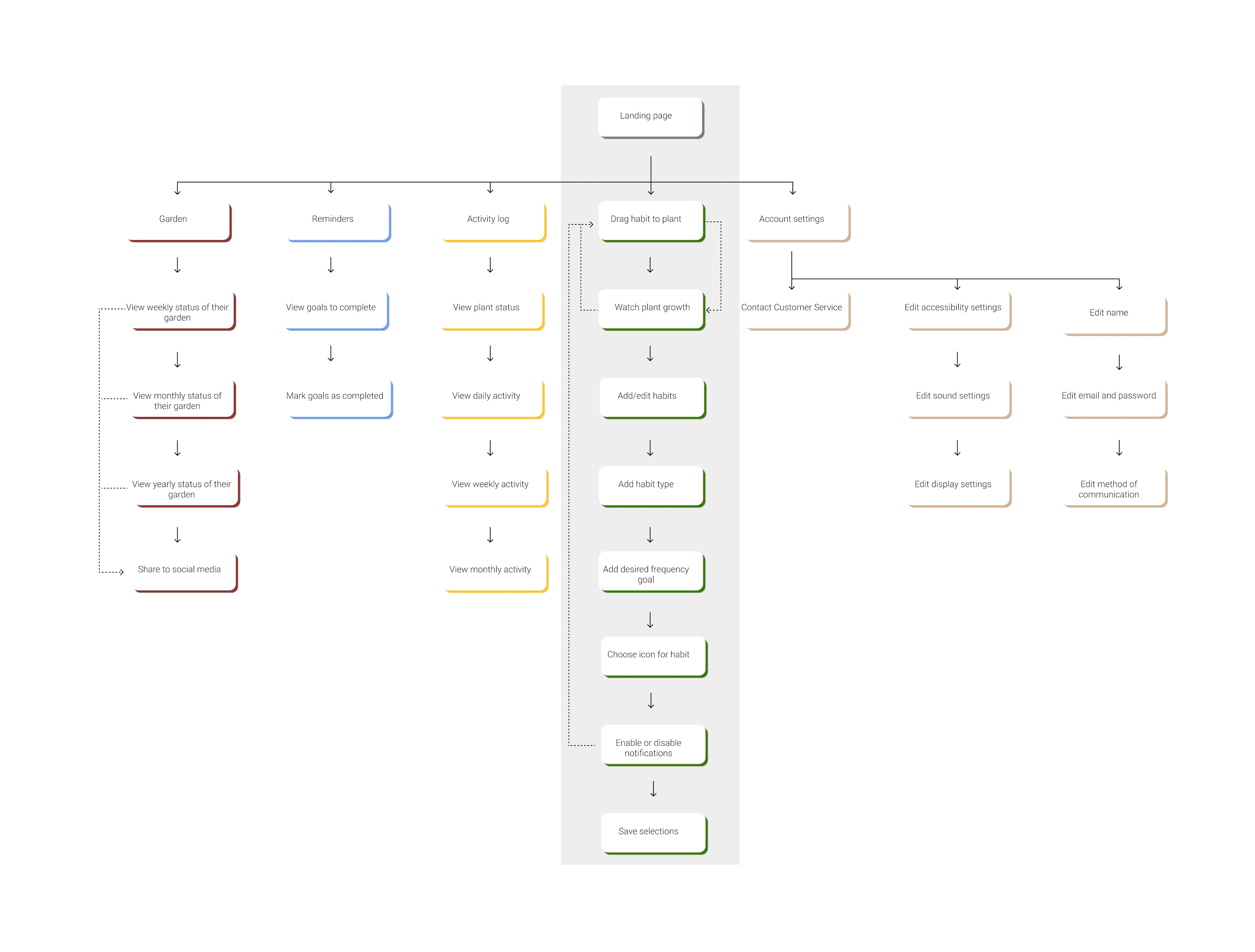
While there is one main flow (dragging habit to plant), I still had to figure out what the rest of the app would contain. This infomation architecture illustrates alternative paths and key user actions such as how to add/edit habits and check on your garden, which is a visual representation of your progress over time.
.
Final Solution
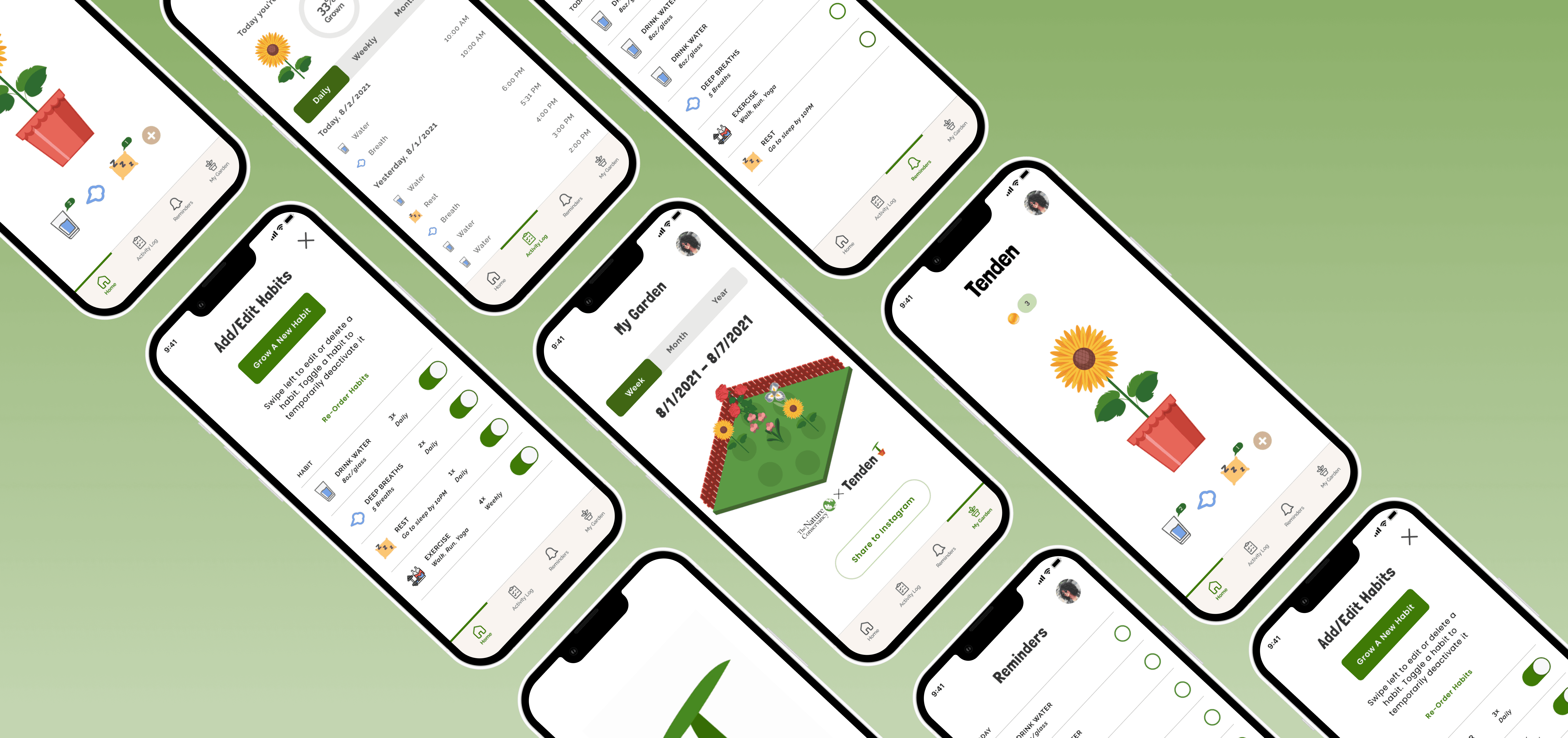
Here is the final iteration of the main habit tracking task, along with some pivotal design decisions I made along the way.

DYNAMIC DAILY TASK
At first I designed the experience for the plants to grow at the same pace as their real-world counterpart, further paralleling and reinforcing the subtle nature of how plants change and grow.
Users did not react well to this concept, which is why the final design has users growing a new plant every day.
The original design was to also reflect plants dying if users did not input any habits, but users also reported that negative reinforcement on discouraged them from continuing to use the app so that idea was scrapped as well.
From our user research, the #1 insight we found was that users wanted to focus on different health goals aside from the three we proposed.
Although my initial intent was to essentially "force" users to focus on the 3 basic habits, allowing them the freedom to choose their habits provided a more robust app and better overall user experience.
I also implemented a reminder function and an option to choose frequency because some habits are repeated more times than others.
CUSTOMIZEABLE SETTINGS


Research shows that self-improvement is most effective when there is a level of accountability. User feedback also shows that users are more likely to regularly use an app if there is a social aspect that allows collaboration with their friends.
From this feedback came the "Garden" feature which visually shows the plants you've grown over time by tracking your daily habits, as well as sharing on social media your progress.
Next steps for this feature would be to grow gardens in collaboration, with each user having different breeds of plants - which opens up even more business and design opportunities.
COMMUNITY INTEGRATION
INTERACTIVE PROTOTYPE
.
Brand & Style Guide
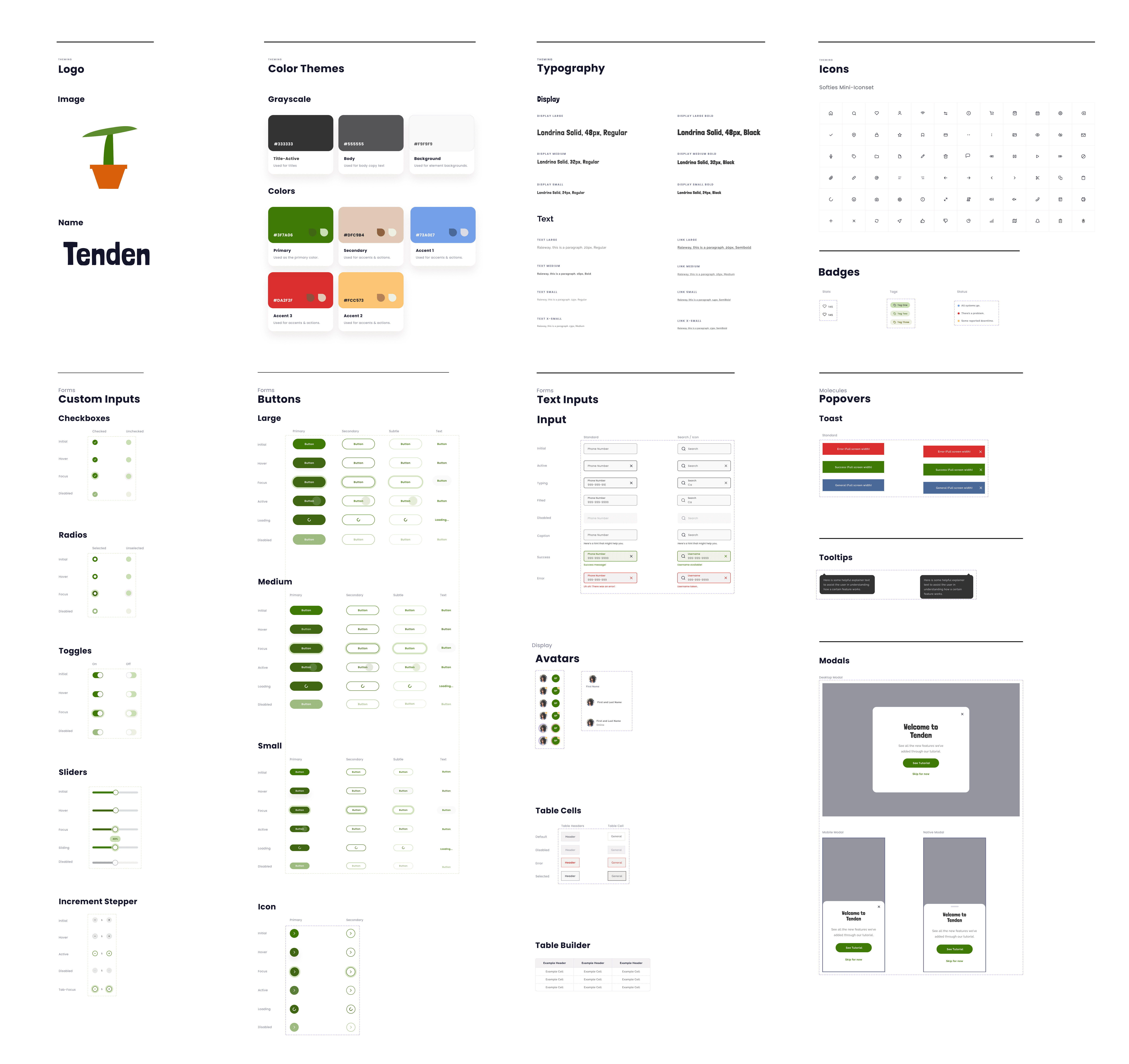
I proposed our branding to have more earthy elements to reflect the “gardening” aspect of the app. We talked about having 3D elements due to the "game" nature of the app, but stuck to flat illustrations as it worked better with our chosen branding and color scheme.
Creating a design system allowed me to become more efficient in my designs and was great practice in working with components.
.
Reflection
This was my first UX project and was created for the purposes of that class. However, if I were to continue working on Tenden, I would focus on defining business goals and adapting my designs based on those, as well as test the most current iteration to understand pain points and uncover gaps we may have missed. Here are others things I've learned during this process:
Explore more one touch interactions
With more time, I would have wanted to explore more “one touch” interactions for tracking habits but still keep the integrity of the gamified aspect of the app. We lost too many users in the middle of the user flow.
What else would have resonated?
Designing for AI is a whole other battle. Most of the functionalities are aided by AI, and if I had more time for this project I would have explored more about the effects of AI algorithms in design. It also taught me that “The AI will do it” is not an acceptable excuse for design problems that don’t have an easy answer. There are clear ways to guide the user or design systems to achieve goals without AI.
Much respect to game designers
Overall, creating the user experience for an app while also trying to incorporate game mechanics was a very ambitious attempt at my first UX design. I have even more respect for game designers after seeing first-hand all the moving parts you had to accommodate for! I’m grateful for this experience as it taught me many valuable lessons that I have taken with me in my future projects and has made me a stronger designer.
Sometimes simple is too simple
If I could go back, I would have started with customizable habits and adjusted the messaging from there. It was validated early on that my assumption of focusing on 3 main habits was rejected by users, making them feel like they were "told what to do." I learned that we must not impose things on users but guide them through our designs.


